
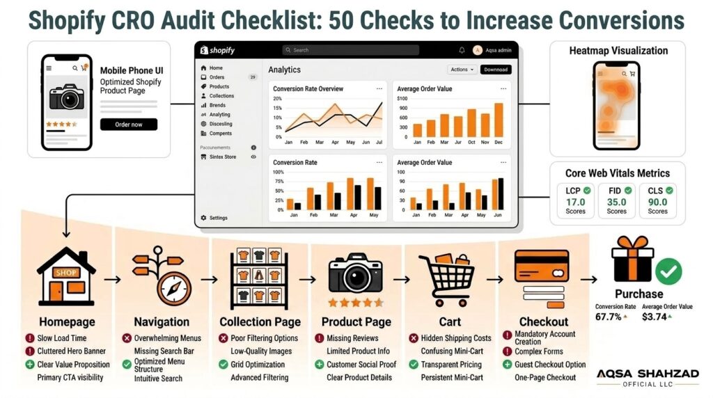
Your Shopify store gets traffic, but sales aren’t keeping up. Visitors browse, add an item to the cart, and then leave. More ad spend won’t fix that. The problem is usually small points of friction inside the store that add up until shoppers stop buying.
This Shopify CRO audit checklist gives you 50 practical checks to find that friction, organized by the part of the store each one affects. You’ll also learn how to prioritize what you find and turn it into real improvements.
Key Takeaways
- A Shopify CRO audit shows where and why visitors fail to convert, from the homepage through checkout.
- Before you change anything, confirm whether the problem is your store or the quality of your traffic.
- Product pages, cart, and checkout usually hold the highest-impact fixes, because that’s where buying decisions happen.
- Mobile needs its own review. Mobile and desktop problems are often different.
- Site speed and UX should be audited together, since slow pages and cluttered pages often share the same causes.
- Check that your analytics are accurate before you trust them, and pair the numbers with heatmaps and recordings.
- Prioritize by impact, confidence, and effort. Fix clear bugs right away and save A/B tests for uncertain changes.
What Is a Shopify CRO Audit?
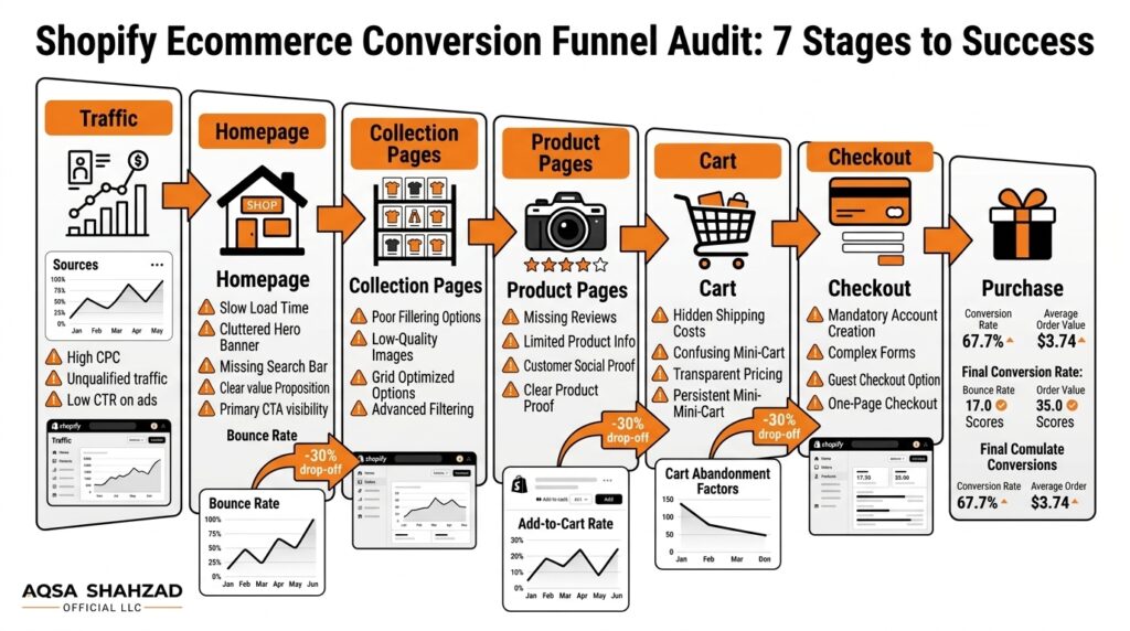
A Shopify CRO audit is a structured review of your store that finds where visitors drop off and why. It combines analytics, UX review, technical checks, and customer behavior data to produce a prioritized list of improvements.
Conversion rate optimization (CRO) is the ongoing work of getting more visitors to take valuable actions, such as adding to cart or completing a purchase. The audit is the diagnostic step. It tells you what to fix before you spend time and money changing things.
CRO Audit vs. Shopify Speed Audit
A Shopify speed audit looks only at performance: load time, responsiveness, and layout stability. A CRO audit covers speed too, but it also covers messaging, product pages, trust, checkout friction, and customer behavior. A fast store can still convert poorly, and a store with great messaging can still lose mobile shoppers to slow pages. That’s why it helps to review both together.
Before You Start: Store Problem or Traffic Problem?
Low conversion rates don’t always mean the store is broken. If conversions dropped right after you launched a new social ad campaign, the product pages probably didn’t get worse overnight. You may simply be attracting less-qualified visitors.
Segment your data in GA4 or Shopify Analytics before drawing conclusions:
- By traffic source: If email and organic search convert well but one paid channel doesn’t, review that channel’s targeting first.
- By device: If mobile lags far behind desktop on the same traffic, look for mobile UX or speed issues.
- By landing page: If one page bounces much more than similar pages, the page is likely the problem.
If performance is weak across every source and device, the store experience is the likely cause. That’s where this checklist comes in.
The 50-Point Shopify CRO Audit Checklist
Run every check on a real phone as well as on desktop. Take screenshots and note which pages get the most traffic so you can prioritize later.
Homepage (Checks 1–4)
The homepage should tell new visitors what you sell, why they should trust you, and where to go next, all within a few seconds.
- Clear value proposition above the fold. On mobile, without scrolling, a stranger should understand what you sell and why it’s different. “Organic cotton bedding, made in the USA” works better than “Sleep better.”
- One primary CTA. Use a single clear next step, such as “Shop Best Sellers.” Several competing buttons split attention.
- Accurate, consistent promotions. The free-shipping threshold in the announcement bar should match the cart. Expired sales and broken discount codes cost you trust quickly.
- Obvious product discovery paths. Feature your highest-revenue collections, best sellers, or shop-by-need sections like “Gifts Under $50.”
Navigation and Search (Checks 5–9)
Visitors who use search often have high purchase intent, which makes poor search results an expensive problem.
- Menu labels match customer language. Use names like “Running Shoes,” not internal names like “SS26 Drop.” Keep key collections no more than two levels deep.
- Easy mobile navigation. Shoppers should reach any key collection in two or three taps, with search visible in the header.
- Predictive search works. Type partial product names. Results should show products and collections as the shopper types.
- Relevant results for synonyms and misspellings. If “sneakers” works but “tennis shoes” returns nothing, add synonyms with Shopify’s free Search & Discovery app.
- Zero-result searches are monitored. Check Shopify’s “searches with no results” report every month. Each query is a shopper who told you exactly what they wanted and found nothing.
Collection Pages (Checks 10–15)
Collection pages are where shoppers compare options. If they have to open every product to find basic information, many give up.
- Filters match buying criteria. Size, color, price, and availability are the basics. Add filters specific to your products, like “skin type” or “pet weight.”
- Useful default sort. Alphabetical order can bury your best sellers. Try “best selling” or a curated order.
- Informative product cards. Show the name, price, sale price, star rating, and available colors, with enough detail to click confidently.
- Consistent product images. Use the same aspect ratio and background across the grid. A hover image showing the product in use helps on desktop.
- Clear stock status. Decide whether sold-out products should be hidden, moved to the end, or clearly labeled. Don’t leave them scattered through the grid.
- Quick add where it fits. It works well for simple or repeat purchases. It works poorly for products that need a size guide.
Product Pages (Checks 16–25)
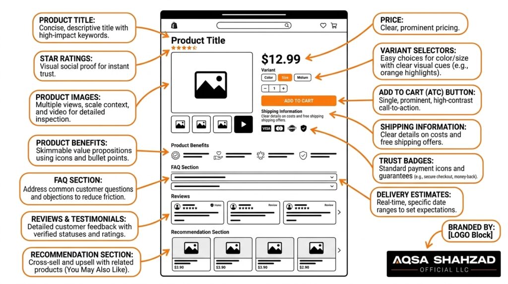
Shopify product page optimization is where most of the gains are. A common pattern is a product page with plenty of traffic but few add-to-carts, because the price, delivery details, or CTA are hard to find on mobile.
- Key info above the fold. On mobile, shoppers should see the title, price, rating, and a path to the add-to-cart button without hunting.
- Complete product images. Show multiple angles, scale, close-up detail, and the product in use. Variant images should update when an option is selected.
- Benefit-led, scannable descriptions. Lead with why the product matters, then put specs, materials, and care instructions in collapsible sections.
- Error-proof variant selection. Use clear swatches or buttons, mark unavailable combinations, and place a size guide next to the size selector.
- Clear pricing. Show compare-at prices for sales. For higher-priced items, add an installment message such as Shop Pay Installments.
- A prominent add-to-cart button. It should be the most visible element on the page and give clear confirmation after it’s clicked.
- Visible, believable reviews. Put star ratings near the title and detailed reviews, with photos where possible, further down the page.
- Shipping and delivery expectations. US shoppers expect to see shipping cost and timing, such as “Ships in 1–2 business days,” before checkout.
- FAQs that answer real objections. Pull repeated questions from support emails and reviews (“Does it run small?”) and answer them on the page.
- Relevant recommendations. Complementary products help. Random ones add clutter.
Cart (Checks 26–30)
The cart is where shoppers review the total and decide whether to commit. Unexpected costs and distractions here often lead to abandoned carts.
- Clear, editable cart. Show images, variants, quantities, and a subtotal that updates instantly. Quantity buttons should be easy to tap.
- Shipping clarity. A progress message like “You’re $12 away from free shipping” can lift order value. Make sure the numbers match checkout.
- Low-distraction discount field. A large coupon box can send shoppers off to search for codes. If a discount applies automatically, show that it has.
- Relevant cross-sells. Small add-ons that complement the cart work best. They shouldn’t push the checkout button out of view.
- Obvious checkout CTA and express pay. Shop Pay, Apple Pay, Google Pay, and PayPal reduce friction, especially on mobile.
Checkout (Checks 31–35)
Shopify’s checkout is already well optimized, but settings, shipping configuration, and payment options are still in your control. Place a test order on your phone as a first-time customer.
- Guest checkout allowed. Don’t force account creation. Review your Shopify checkout settings.
- Expected payment methods. Major cards, digital wallets, and, depending on your average order value, PayPal or buy-now-pay-later options.
- Transparent shipping and taxes. Name shipping options with delivery times. Since US sales tax appears at checkout, mention “taxes calculated at checkout” earlier in the journey.
- Simple forms and helpful errors. Remove unneeded fields and confirm address autocomplete works. Enter a wrong ZIP code on purpose to test whether the error message is clear.
- Abandoned checkout recovery. Review your abandoned checkout emails and timing. You can add consent-based SMS marketing for stronger recovery.
Mobile (Checks 36–39)
Mobile often brings most of a store’s traffic but converts below desktop. A large gap usually means mobile-specific friction.
- Sticky add-to-cart. On long product pages, keep the main CTA in reach without covering content or chat widgets.
- Large tap targets. Test buttons, swatches, and filters with your thumb. Google’s tap target guidance is a useful reference.
- Mobile content hierarchy. Put the most important information first. Images should be swipeable and zoomable, and text readable without zooming.
- Controlled popups. Email popups, cookie banners, and chat bubbles shouldn’t stack up or interrupt high-intent visitors who arrive from ads.
Site Speed (Checks 40–43)
A Shopify speed audit finds what makes pages feel slow or unstable. Heavy pages often hurt UX too, so fixing one usually helps the other.
- Core Web Vitals from real users. Check LCP, INP, and CLS in Shopify’s web performance reports. Google’s “good” thresholds are LCP ≤ 2.5s, INP ≤ 200ms, and CLS ≤ 0.1 (Core Web Vitals). Use PageSpeed Insights to diagnose individual pages.
- Optimized images. Avoid oversized uploads. Lazy-load images below the fold, but never the main hero or product image.
- App and script bloat. List every app and remove unused ones, duplicates, and leftover code from apps you’ve already uninstalled.
- Theme health. Check whether your theme is Online Store 2.0, up to date, and free of old customizations no one uses anymore.
For deeper issues, a Shopify store speed optimization review can trace theme and script problems, or you can get a baseline with these free Shopify audit tools.
Trust and Social Proof (Checks 44–47)
Trust matters most for newer brands, higher-priced products, and social ad traffic. Place reassurance where doubt appears: near the price, the CTA, and the cart.
- Clear return policy. Summarize it on product pages (“Free 30-day returns”) and link it in the cart and footer.
- Visible contact info and brand story. Show an email address, chat, or phone number, plus a real About page.
- Real reviews and UGC. Use customer photos and real testimonials across the store. Never use fabricated reviews.
- Payment reassurance. A short “Secure checkout” message and accepted payment icons near the CTA. Keep it clean, not a cluster of badges.
Analytics and Measurement (Checks 48–50)
Analytics show where visitors drop off. Qualitative research shows why. You need both.
- Accurate tracking. Compare orders in Shopify Analytics with GA4. Confirm that GA4 ecommerce events such as add_to_cart, begin_checkout, and purchase fire correctly.
- Funnel analysis by device. Track add-to-cart rate, checkout initiation, checkout completion, and revenue per visitor, broken down by device and traffic source.
- Qualitative insights. Use heatmaps and session recordings (for example, Microsoft Clarity), along with on-site surveys and support tickets, to understand behavior.
Shopify Plus CRO Audit Considerations
Every check above applies on any plan. A Shopify Plus CRO audit adds a few areas, because Plus offers more checkout control:
- Checkout Extensibility: Review whether checkout UI extensions add useful trust messaging, delivery info, or upsells without clutter, and confirm that older checkout customizations were rebuilt correctly.
- Shopify Functions: Use custom discount, payment, and delivery logic to show the right options to the right customers.
- B2B experiences: Wholesale buyers need quick ordering and account-based pricing. If you sell wholesale, audit B2B commerce separately.
- A/B testing: Plus-level traffic usually supports proper testing, so build a testing roadmap, not just a list of fixes.
Not every store needs Plus. If you’re already on it or evaluating it, Shopify Plus development can help you get full value from these features.
How to Prioritize Your Findings
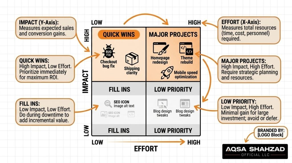
An audit can easily turn up 30 or more issues. Score each one from 1 to 5 on these factors:
- Impact: How much could fixing it affect revenue?
- Confidence: Is it backed by data, recordings, or customer feedback?
- Effort: How much time and development work does it need?
- Traffic and funnel stage: How many shoppers does it affect, and how close are they to buying?
High-impact, low-effort fixes on high-traffic pages come first. One simple rule: fix bugs, don’t test them. A broken size selector should be fixed immediately. A/B tests are for changes where the outcome is uncertain.
The CRO Audit Implementation Process
Change block type or style
Move Heading block from position 54 up to position 53
Move Heading block from position 54 down to position 55
Change alignment
Change text alignment

Displays more block tools
A clear CRO audit implementation process turns findings into results:
- Audit and document. Record each issue with the page, device, a screenshot, and supporting evidence.
- Prioritize. Sort findings into fix now, test, and plan for later.
- Implement. Make changes in a duplicate theme first. For larger redesigns, UX/UI design support helps turn findings into better layouts.
- Test. Change one variable at a time and run tests across full weekly cycles. Low-traffic stores can compare before-and-after results over similar periods.
- Measure and repeat. Track the metric each change was meant to move, record what you learned, and move to the next item.
CRO is ongoing. Many stores move to a CRO experimentation retainer after their first audit. If a big sales season is coming up, run a BFCM readiness audit weeks ahead, not days.
When to Get a Professional Shopify CRO Audit
You can work through this checklist yourself. Outside help makes sense when conversions stay low after the obvious fixes, when ad spend is high, when your catalog or tech stack is complex, or when you don’t have time to implement and test properly.
Aqsa Shahzad’s Shopify conversion rate optimization services cover research, auditing, implementation, and testing. You can request a free CRO audit to see where your store may be losing sales, or browse the case studies first.
Conclusion
Higher Shopify conversion rates rarely come from one big redesign. They come from steadily removing friction: unclear messaging, weak search, missing delivery details, slow mobile pages, and tracking you can’t trust. Use this Shopify CRO audit checklist to find those issues, prioritize by impact, and implement changes carefully enough to measure what works.
Frequently Asked Questions
What should a Shopify CRO audit include?
It should cover the homepage, navigation and search, collection pages, product pages, cart, checkout, mobile usability, site speed, trust signals, and analytics accuracy. It should also include a prioritized action plan.
How do you perform a CRO audit on Shopify?
Start by verifying your tracking. Then segment conversion data by device and traffic source, review each page template on mobile and desktop, use heatmaps and recordings to understand behavior, and prioritize fixes by impact and effort.
How often should I audit my Shopify store?
A full audit once or twice a year works for most stores, plus a focused review after a theme change, new app installs, or a shift in traffic sources, and before Black Friday and Cyber Monday.
What’s the difference between a CRO audit and a Shopify speed audit?
A speed audit focuses only on performance metrics like load time and Core Web Vitals. A CRO audit includes speed but also reviews UX, messaging, trust, checkout, and customer behavior.
Can I do a Shopify CRO audit myself?
Yes. With this checklist and free tools like Shopify Analytics, GA4, PageSpeed Insights, and Microsoft Clarity, most store owners can find meaningful improvements. Professional help is most useful when problems persist or the store is technically complex.