
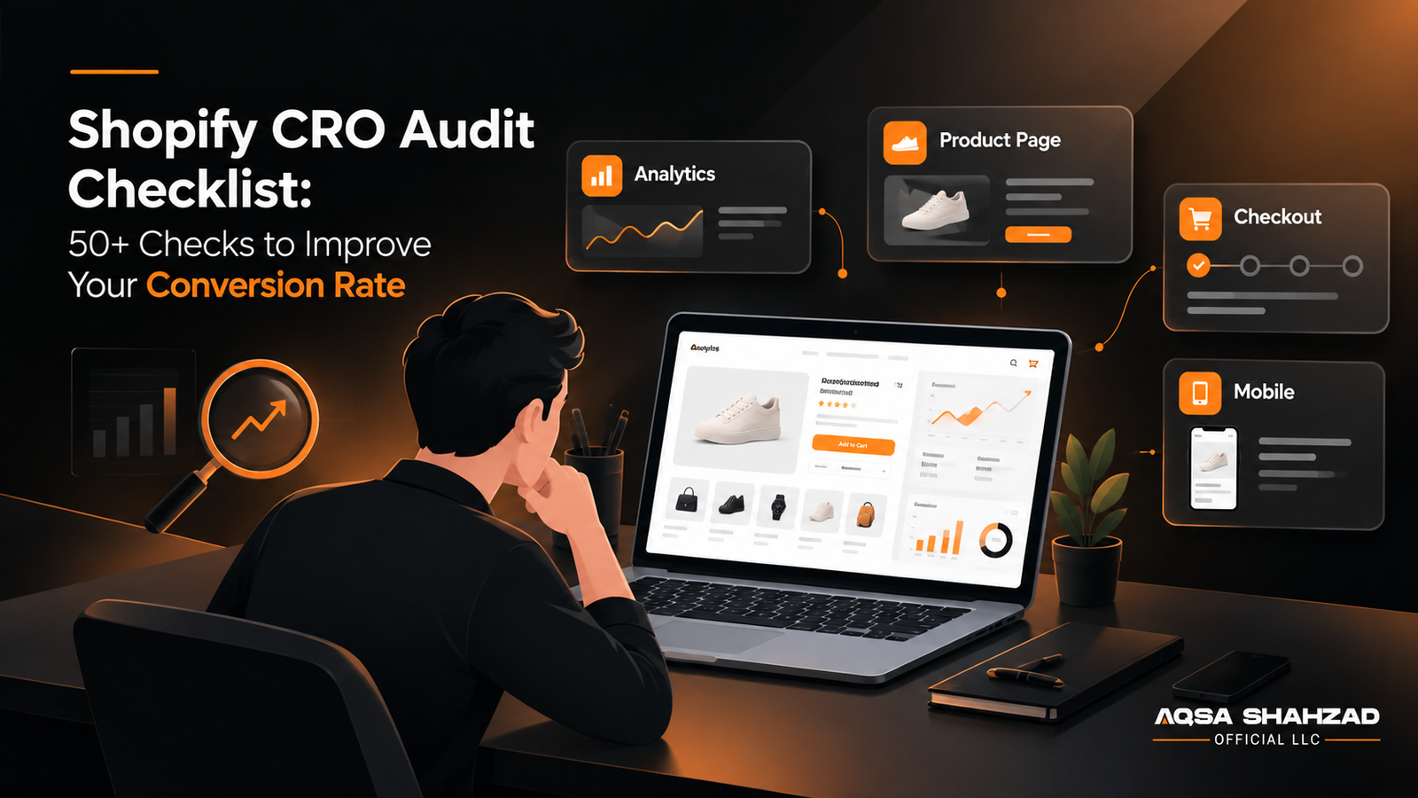
Getting traffic to your Shopify store doesn’t guarantee sales. If visitors browse products, add items to cart, and still leave, you need to find where the buying journey breaks down.
A Shopify CRO audit helps you identify those friction points across your storefront, product pages, cart, checkout, mobile experience, and tracking.
This checklist gives you 50+ checks you can use to find conversion problems and decide what to fix first. If you would rather have a specialist map this for you, our free CRO audit does exactly that in 48 hours.
Key Takeaways
- A CRO audit finds where visitors drop off across your store. It doesn’t fix anything by itself, it tells you what to fix.
- Accurate tracking comes first. If your analytics data is wrong, every other finding in the audit is unreliable.
- Behavior data like heatmaps and session recordings explains the “why” behind a drop-off, not just where it happens.
- The biggest drop between two consecutive funnel stages is usually your highest priority, not the store’s overall conversion rate.
- Checkout and mobile experience typically hold the most hidden friction on Shopify stores.
- Prioritize fixes by impact, confidence, and effort, not by which problem looks the most obvious.
What Is a CRO Audit?
A CRO audit is a structured review that identifies the barriers stopping visitors from completing a purchase, using analytics, behavior data, and page level review together, rather than judging any one page alone. Shopify CRO services can then turn those findings into structured experiments and fixes.
It differs from an SEO audit, which checks organic visibility, and a UX audit, which focuses on usability regardless of purchase intent. A/B testing validates one specific change once you already have a hypothesis. A CRO audit sits above all of these.
| Audit | Primary purpose |
|---|---|
| CRO audit | Identify conversion barriers and opportunities |
| UX audit | Identify usability problems |
| SEO audit | Identify organic search issues |
| A/B testing | Validate specific changes |
The 50+ Point Shopify CRO Audit Checklist
If your Shopify store isn’t converting the way it should, the instinct is usually to redesign something — a bigger button, a new banner, a flashier homepage. But most conversion problems aren’t design problems. They’re tracking problems, funnel problems, or trust problems that a redesign won’t fix.
This checklist walks through the same process we use when auditing a Shopify store, broken into 8 sections. Work through them in order — each section builds on the one before it.
1. Analytics and Tracking
Why this comes first: tracking has to be correct before anything else on this list means much. A page that “looks like” it’s underperforming might just be undertracked.
Before you touch a single design element, confirm your data is trustworthy.
Data Accuracy
- Shopify and GA4 sales data are reasonably consistent
- Purchase tracking records each order only once
- Revenue and order values are being recorded correctly
- Recent orders can be matched against reported data
Event Tracking
- Add-to-cart actions are tracked across the store
- Checkout and purchase events are working correctly
Reporting & Segmentation
- Conversion data can be broken down by traffic source
- Mobile and desktop conversion data can be compared
2. Customer Behavior and UX
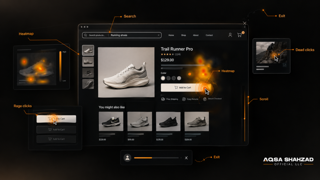
A real CRO audit doesn’t just look at a page and say “this button should be bigger.” Behavior data tells you whether visitors are confused, frustrated, or simply not interested — and each of those needs a different fix.
Behavior Signals
- Session recordings are reviewed on key pages
- Heatmaps are checked for scroll depth and click patterns
- Rage clicks are identified and investigated
- Dead clicks on non-interactive elements are reviewed
Visitor Intent & Exits
- Site search queries are reviewed for visitor intent
- Pages with unusually high exit rates are flagged
Audience Comparison
- New vs. returning visitor behavior is compared
- Mobile vs. desktop behavior is compared
3. Conversion Funnel
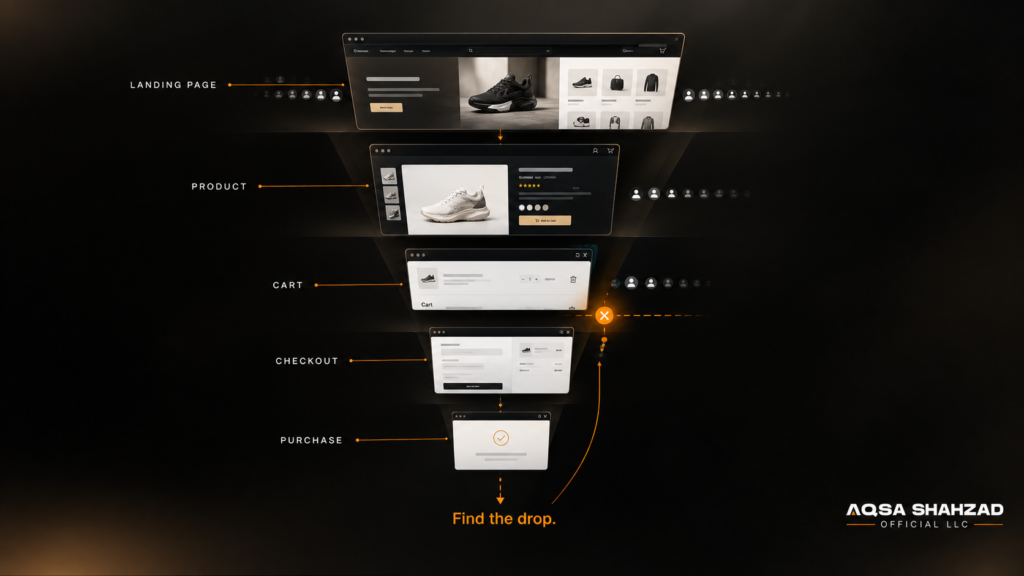
Don’t judge the store’s conversion rate in isolation. Find the largest drop between two consecutive stages, then investigate why that drop happens.
| Funnel Stage | Metric to Check |
|---|---|
| Landing page | Engagement / exit rate |
| Product page | Product-view → add-to-cart rate |
| Cart | Cart → checkout rate |
| Checkout | Checkout → purchase rate |
| Overall | Conversion rate, benchmarked against your own history |
Funnel Checklist
Landing & Product
- Landing page engagement and exit rate is checked
- Product-view to add-to-cart rate is calculated
Cart & Checkout
- Cart to checkout rate is calculated
- Checkout to purchase rate is calculated
Overall Performance
- Overall conversion rate is benchmarked against your own history
4. Homepage and Navigation
Zero-result searches matter more than they seem — these are visitors who told you exactly what they wanted and got nothing back.
First Impression
- Headline explains what you sell within seconds
- Primary CTA is visible above the fold
- Social proof appears early on the page
- Promotional banners don’t bury the main message
Navigation & Discovery
- Category navigation is logical and not overloaded
- Site search returns relevant results for common terms and misspellings
- Zero-result searches are tracked and reviewed
5. Collection and Product Pages
Reviews near the buying area and a clear returns policy reduce hesitation more than most redesigns do.
⚠️ Never fabricate urgency or stock counts. Misleading scarcity damages trust the moment it’s discovered.
Product Information
- Product title is clear
- Price is immediately visible
- Product images support the buying decision
- Product variants are easy to select
- Stock and availability status is obvious
Trust & Objection Handling
- Reviews appear near the buying area
- Shipping information is clear
- Returns policy is easy to find
- FAQs answer common objections (sizing, materials, warranty)
Shopping Experience
- Primary CTA is easy to find
- Collection filters actually match how customers shop
- Mobile CTA is easy to tap
6. Cart and Checkout
Forcing account creation before Shopify checkout is a well-documented cause of abandonment.
Cart Transparency
- Shipping costs and free shipping threshold shown before checkout
- Cart quantity is easy to edit
- No new fees appear at checkout that weren’t shown in the cart
- Delivery estimates are visible before payment
Checkout Friction
- Guest checkout is available
- Shop Pay or another express payment option is offered
- Form fields are kept to what’s necessary
- Checkout works the same on mobile as desktop
If checkout is where your store is bleeding conversions, see our Shopify checkout optimization guide for specific fixes. Shopify Plus merchants should also review checkout extensibility for custom logic the default checkout won’t support.
7. Mobile and Site Speed
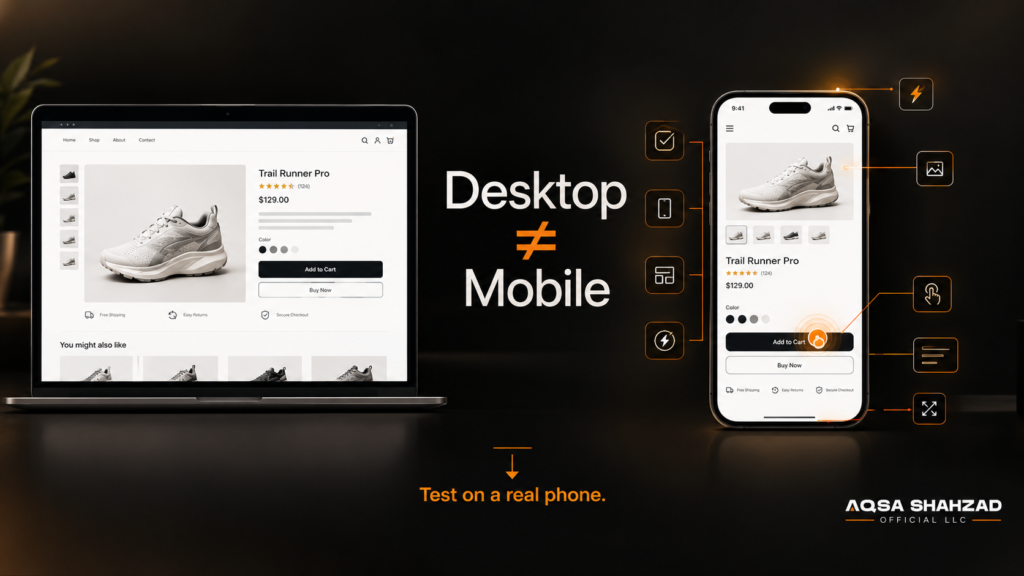
Test mobile directly on a phone don’t assume desktop behavior carries over.
Mobile Experience
- Layout is genuinely responsive, not just shrunk down
- Tap targets are large enough to avoid mis-taps
- Forms are optimized for mobile keyboards
- No unwanted horizontal scrolling or layout shift
Performance
- Shopify theme performance is checked against Core Web Vitals
- Image compression and app bloat are reviewed
- Mobile page speed is tested separately from desktop
Google’s Core Web Vitals thresholds are a useful benchmark for what “fast enough” actually means. If your Lighthouse score is below 80, run a full Shopify speed optimization review separately.
8. Trust, Copy and Testing
There’s no universal fixed number of days an A/B test should run — that depends on your traffic and existing conversion rate.
Trust & Credibility
- Reviews and ratings are genuine and visible
- Guarantees and return policy are in plain language
- Contact information and business details are easy to find
Copy & Objections
- Copy states benefits in customer language, not internal jargon
- Common objections are addressed before the visitor has to ask
Testing
- One primary metric is defined before any A/B test launches
- Tests run to statistical significance, not stopped early
How to Prioritize CRO Fixes
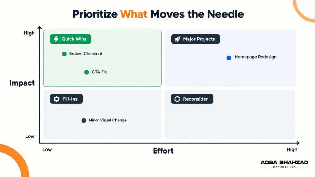
Don’t prioritize CRO fixes based on how obvious they look. Prioritize them based on potential impact, confidence in the evidence, and implementation effort.
| Opportunity | Impact | Confidence | Effort | Priority |
|---|---|---|---|---|
| Broken checkout | High | High | Low | Highest |
| Product page CTA issue | High | Medium | Low | High |
| Homepage redesign | High | Medium | High | Medium |
| Minor visual change | Low | Low | Low | Low |
CRO Audit FAQs
1.What is a CRO audit?
A structured review that identifies where visitors drop off and why, combining analytics, behavior data, and page level review.
2.What does it include?
Analytics accuracy, customer behavior, the full funnel, homepage, product and collection pages, cart, checkout, mobile experience, speed, and trust signals.
3.How often should a Shopify store run one?
Roughly once or twice a year, plus a lighter review after any major redesign or launch. Running one ahead of peak season, such as our BFCM readiness audit, catches issues before they cost you during your highest traffic weeks.
4.How is it different from A/B testing?
An audit diagnoses where and why problems exist. A/B testing validates a specific proposed fix.
5.How do you prioritize the findings?
Rank each issue by impact, confidence, and effort, and fix the high impact, high confidence, low effort issues first.
Final Thoughts
A CRO audit is not a one time project. Conversion friction shifts as your catalog, traffic, and customer expectations change, which is why the most effective stores treat this checklist as a recurring process. What part of your funnel do you suspect is losing you the most conversions right now?